I have decided to discuss this article as i think it is perfect for this part.
The style of this article seems to be extremely relaxed and casual, the colours are very plan and simple using the black, white and red. The simple colours also look great against the huge picture of the artist, which is printed using numerous colours.
We find out quite a bit from this artist, using just a simple question, plus, from the article we realise the artist is a very chatty person. I think this is brilliant in a magazine, it helps you understand the artist a lot more and to be able to relate to them. The big, bold, black lettering for sub-headings suggest what the next paragraph is about without giving too much away, it makes you want to read on and fi nd out more about the artist.
'Puff the magic dragon', 'a boy named Sue', 'Johnny, remember me', 'Hold on im coming', and 'only after dark' are all in different fonts compared to the rest of the article, this defines the sentences being some new and being the topic of conversation in that paragraph. The small font the article is mainly in is easy to read, and quite feminine to match the artist and to maybe match the readers.
The way the article is set out is brilliant, the huge picture on the left contrasting with the artists life on the right, you get a clear picture of what the artist looks like and how the artist comes across, for example: from this picture I get the feeling she isnt into glamour shoots, more natural and realistic seemed to be more appropriate to her. With their being a small picture in the top right of the cartoon, it adds interest into the article, with something different to look at. The whole page does appear to attract younger readers, its bright, fresh, and especially with the different fonts scattered, it looks different and new.
I would like my article to be somewhat similiar to this as i think it would attract readers and be popular to my age category.
Monday, 31 January 2011
Friday, 28 January 2011
My Questionnaire.
My Questionnaire.
1. What music magazines do you read?
2. Do you find colourful magazines more interesting to read?
3. Do you prefer reading articles or looking at the pictures?
4. What sort of music do you like ?
5. What would you like to read about in an article?
6. What would draw you to a magazine ?
7. Do you prefer harsh or soft fonts ?
8. How much would you pay for a magazine ?
9. Does direct address interest you to buy the magazine?
10. What would interest you to read the contents page ?
My Results:
1. None - 6
Nme - 3
Kerrang - 1
2. Yes - 8
No - 1
3. Reading - 2
Looking - 7
4. Indie - 6
Pop - 3
Folk - 1
Rock - 1
5. New Releases - 6
Style of Band - 2
Their Fashion - 5
What the band gets up to - 3
6. Favourite Celebrity - 2
Famous Person - 5
Good cover - 3
Cheap Price - 1
7. Harsh - 3
Both - 2
Soft - 5
8. £1 - 1
£2 - 5
£3 - 2
£4 - 1
9. Yes - 8
No - 2
10. Pictures - 3
New Storylines - 5
Interesting Layout - 2
I asked ten people my questionnaire, and got some interesting results, the people i asked were ages 16-17 which is perfect for my magazine. From the results i learnt that i will have to form a magazine that will make people buy it and become interested in reading music magazines, it will have to be colourful to interest the audience, with numerous pictures to please the audience. The genre that was most popular was indie music, i do like indie music but i think most people will have the genre of indie music and i want mine to be different. I will talk about new releases, the bands fashion and what they get up to to make my article interesting and fun to read. Obviously I wont be able to have a celebrity as my main model, but i will use direct address to make it as real as possible to the audience. I have decided to use both harsh and soft fonts to appeal to both sexes, also because the people i asked averaged out at using both. The contents page will consist of all three of the options but mainly new and interesting story lines to keep the readers interested and wanting to buy the magazine.
Unique Selling Point.
I am going to try and make my magazine stand out against other magazines. To do this I will make mine colourful to stand out on the shelf, draw the audience to it, but also to appeal to both genders to make more of a profit. The fonts will again appeal to both genders as I want my magazine to be enjoyed by everyone. The pricing wont be over expensive, so that more people can buy it and be happy with the price. The pictures of my models will be creative and eye-catching, and using the direct address will ensure this to happen.
Thursday, 27 January 2011
Feedback 27.1.11
Well done Joanna. Youa re making good progress with your reseacrh already. For the prelim task you must also upload your sketch/plan for the contnents page of the college magazine. Give it to Mike or Nikki with your name on and they will save it to the external hard drive for next lesson when you canb upload it. Carry on witht he reseacrh on the checklist. See me if you need any explanation or help. Also, workshop time is available for you this week but must be used from next week so please see Mike or Nikki to book a computer for your preferred evening.
Mrs A
Mrs A
Analysing a front cover, contents and feature article.
The Conventions of a Front Cover.
The text does create a relationship with the audience, although the main title isn't too big, as the audience will already know what the magazine is, the next text we see is 'celebrity DJs' which will draw the audience making them want to buy the magazine. The model is looking straight into camera with her head slightly to the left which doesn't create as strong relationship with the audience as there could be, but enough to draw them in. This is a convention of a magazine front cover, using direct contact.
This front cover does have many conventions of a magazine as there should be, the title is at the top of the page making it recognisable to the audience, the model is photographed but not using a close up or a medium shot, which could question the conventions of a magazine. There are subheadings all over the page to draw the reader in to buy it. There is a barcode and a web address to publicise the companies website.
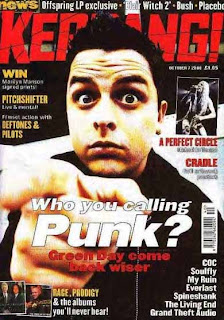
I have decided to publish this magazine front cover to show the contrast between my other magazine and this one. The image does fit the content and appeals to the target audience which i think is 15+ and likes rock or heavy metal music. The model is the first thing you see and has the the same position as the war poster which in the old days threatened you to join the war, and this could be threatening to buy the magazine, as well as asking the question 'who you calling punk?'. The colour scheme is very basic using the dark colours of red, black and a hint of white. These colours are stereotypically associated with males, and the font of the title and subheadings are very harsh and sharp, which would also appeal to the male population.
The fact the model is staring into the audience does create a relationship with them, especially with pointing the finger. I don't think the font and the model using a direct address is very friendly, especially with the facial expression of the model. This magazine does involve using a celebrity to draw the audience in and to increase sales and profit. The colours of this magazine represent the genre of music that is rock, which is a perfect convention of a magazine.
The title is at the top of the page to interest the audience, and will make it recogniasable, the model is photographed using a medium shot for the direct address. The leading subheading dominates the page making the audience buy the magazine. There are numerous subheadings which fit the convention of a magazine perfectly, and are the main stories that are toe be advertised. This magazine does have a barcode and a web address, again to make the audience explore their website.
The Conventions of a Contents Page.
This contents page isn't the brightest that it could be, however, it does use the three main colours: pink, black and white, the pink in this page does make it interesting against the black and white, and does make me want to know more about the magazine. There are many images joined to the pages that will have these pictures on more, which give an insight into what the spread will be about. The title 'mixmag' is beautifully spread across the page to advertise what you are reading and to remind you, and there is a list of contents under sections to make the pages easier to find.
The Conventions of a Feature Article.
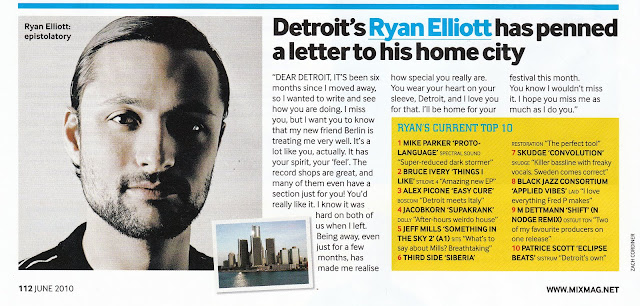
There is a big enough to read and interesting headline to draw the reader in and to explain the story, i don't think this artist has anything to sell a part from the story, which doesn't follow the conventions of a feature article. There is one large image of the artist, and a smaller picture of the location which makes the article interesting. The writing is clear and easy to follow for the audience, and isn't too small to read.
My College Magazine.
I am quite happy with my front cover, however i do think the cutting of Charlotte could have been more precise if i took more time. I think the colours are eye catching and look interesting to the public. I used three main colours: blue, pink and white a part from the title to add more interest. I did find the task quite easy and fun to do, the only thing that seemed to puzzle me was getting the picture of Charlotte and the barcode onto the picture without ruining anything else. With my own magazine i would place more pictures onto the page to make it more interesting.
Sunday, 23 January 2011
Conventions of a magazine.
I explored these conventions:
- must use minimum basic colours on cover.
- publishing a masculine magazine would be enhanced using a male model, same for female.
- use a large dominant celebrity people recognise.
- make sure the colours fit the theme.
- the magazine must appeal to as many people as possible, so photographing different celebs will help this and sell more magazines.
- titles to be bold and eye catching.
- double page spread must be in columns with interesting pictures.
My Ideas.
I would like my magazine to be mature yet interesting. I want to aim it at the age group of 16+ as i think more people will want to buy it and will be popular. I am thinking of experimenting with a retro/vintage theme to put something new out there, and i do think people will be drawn to a different magazine. I do want to interview a band who is interested in vintage music and put their own interpretation to it.
Tuesday, 18 January 2011
Subscribe to:
Comments (Atom)


