The Conventions of a Front Cover.
The text does create a relationship with the audience, although the main title isn't too big, as the audience will already know what the magazine is, the next text we see is 'celebrity DJs' which will draw the audience making them want to buy the magazine. The model is looking straight into camera with her head slightly to the left which doesn't create as strong relationship with the audience as there could be, but enough to draw them in. This is a convention of a magazine front cover, using direct contact.
This front cover does have many conventions of a magazine as there should be, the title is at the top of the page making it recognisable to the audience, the model is photographed but not using a close up or a medium shot, which could question the conventions of a magazine. There are subheadings all over the page to draw the reader in to buy it. There is a barcode and a web address to publicise the companies website.
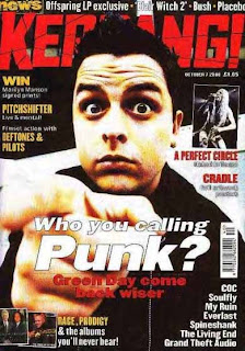
I have decided to publish this magazine front cover to show the contrast between my other magazine and this one. The image does fit the content and appeals to the target audience which i think is 15+ and likes rock or heavy metal music. The model is the first thing you see and has the the same position as the war poster which in the old days threatened you to join the war, and this could be threatening to buy the magazine, as well as asking the question 'who you calling punk?'. The colour scheme is very basic using the dark colours of red, black and a hint of white. These colours are stereotypically associated with males, and the font of the title and subheadings are very harsh and sharp, which would also appeal to the male population.
The fact the model is staring into the audience does create a relationship with them, especially with pointing the finger. I don't think the font and the model using a direct address is very friendly, especially with the facial expression of the model. This magazine does involve using a celebrity to draw the audience in and to increase sales and profit. The colours of this magazine represent the genre of music that is rock, which is a perfect convention of a magazine.
The title is at the top of the page to interest the audience, and will make it recogniasable, the model is photographed using a medium shot for the direct address. The leading subheading dominates the page making the audience buy the magazine. There are numerous subheadings which fit the convention of a magazine perfectly, and are the main stories that are toe be advertised. This magazine does have a barcode and a web address, again to make the audience explore their website.
The Conventions of a Contents Page.
This contents page isn't the brightest that it could be, however, it does use the three main colours: pink, black and white, the pink in this page does make it interesting against the black and white, and does make me want to know more about the magazine. There are many images joined to the pages that will have these pictures on more, which give an insight into what the spread will be about. The title 'mixmag' is beautifully spread across the page to advertise what you are reading and to remind you, and there is a list of contents under sections to make the pages easier to find.
The Conventions of a Feature Article.
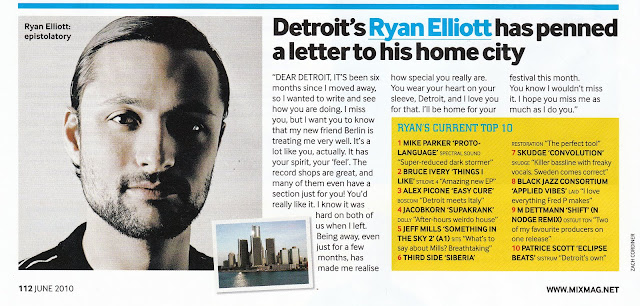
There is a big enough to read and interesting headline to draw the reader in and to explain the story, i don't think this artist has anything to sell a part from the story, which doesn't follow the conventions of a feature article. There is one large image of the artist, and a smaller picture of the location which makes the article interesting. The writing is clear and easy to follow for the audience, and isn't too small to read.


No comments:
Post a Comment