Thursday, 24 March 2011

Audience Feedback.

These are my results of my questionnaire. 

I am really happy with the outcome of this, i wanted the cover to be eye-catching to the public, and looking at the results i have achieved this.

My aim was to make it recognizable that my magazine was aimed at people aged 16+, and i do think i have achieved this by using the correct language and conversation along with the correct colours.

The contents page was really important to me as it tells the viewer part of the storied already whether they want to turn to that page or not, and for most people to say it looks legit is brilliant.
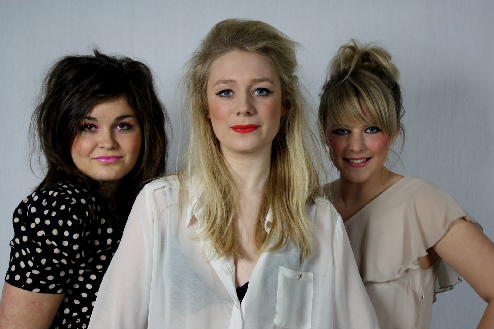
I intentionally wanted the band to appear as a pop band that is very up to date and understands the music. I think with my photographs and how i have portrayed them to look they do give the impression they are a pop band, which is exactly what i wanted.
This result was quite interesting to find out, as i wondered why people said no, but they soon explained that the questions should have been more explicit and interrogating to find out more about the band.
I can understand where they are coming from but i do think not all people like explicit things, and i have to try and make my magazine appeal to everyone.
I am extremely happy with this result as i wanted my magazine to appeal to everybody, and most people think i have done so.

I am really pleased with the results and understand that i have kept most of my initial ideas from the beginning. I believe it looks professional and real enough to be put on the shelves.

my magazine.


Tuesday, 22 March 2011

Changes.

The changes that i have had to do.

Front Page.
- Instead of using the 'play' symbol separately, i put the 'play' symbol in the 'P' of the Play to represent the space in the 'P' and to give my page more space.
- I did want to have the models faces instead of the full body but unfortunately i didn't use the correct shot.
- The different style of 'play' down the side of the page were just a random added extra to bring my page more to life and was not meant to happen in the first place.

Contents.
- Again the 'plays' on the page were not firstly intended to be there.
- The 'contents' and 'play' are not in the place they were meant to be as i think they look better as they are.
- The picture was meant to be in the middle of the page, but now is at the bottom.

Article Page.
- The title is completely different to what it was meant to be as i think this title now explains more.
- The pictures are not in the place they were meant to.

Tuesday, 1 March 2011

My changes and challenges.

I can only think of one change, which is i wont be using the 'play' button on my front cover.
My challenges: getting used to the technology we have to use such as photoshop and indesign.
- Achieving the correct draft of article so it appears to everybody.
- Updating the blog, whenever i can.
- Making sure people were available for my photo shoot.

My Pictures.

I will maybe use this for the article page.
i will maybe use this for the article page.

i will use this photograph for the contents page.

i will maybe use this for the article page.

i will use this photograph for the front cover.

i will maybe use this for the article page.

These are my photographs.

Thursday, 10 February 2011

Feedback 9.2.11

Joanna, please change the blog title immediately. If you did not change it please let me know and also tell me (if you know) who has done this. This is coursework and this is completely inappropriate and will not be tolerated.

You are making good progress with your work here. I know you are currently writing the first draft of the article so please let me take a look at it as soon as it's finished. You should also get the studio booked and organise your photo shoot for early next week. You must ensure that you ahve work to complete during lesson times next week.

See me if there are any further issues.

Mrs A

Monday, 7 February 2011

Reader Profile.

The person who i want to be reading my magazine is to be 16 or above, therefore there can be swearing if appropriate. They will have good knowledge about what music they are into and what they want to get out of the magazine. I want both genders to be interested in my magazine as i want to make as much profit as possible and to influence both genders, it will also be a weekley magazine to please both genders. The colours of my magazine will interest my person massivley which will then develop into telling his/hers friends about the magazine. They will read the magazine because of the range of music in it, even though it is based on dance/retro, the journalistic style of the magazine will be mature and have a slight sarcasm add to it to please the reader and his/her friends.

Friday, 4 February 2011

My Calender.

To organise my time i am going to use a calender.
Monday 7th February - Do photographs in studio.
Tues 8th February - Draft of article in lesson.

This is all i know for now but will update it as i go along. 

My Mock Ups.

These are my mockups of each page. I have thought about where i want my pictures and text to be, and how i think it will look the best.


Thursday, 3 February 2011

My Photo Shoots - props costumes models.

I have decided to use three models for my magazine: Natalie, Daniella, and Isabelle. i have chosen these three girls as i think they would represent my target audience the best, and can be made to look like a true band.

What the girls will be wearing:
Isabelle: Hair will be backcombed, big + wild.
               Black eyeliner, red lipstick.
               Green Skirt, cream shirt.
               Cream Heels.
Natalie: Most of hair backcombed, with fringe.
              Pink eyeshadow with eyeliner, pinkish lips.
              Polka dot playsuit.
              Black heels.
Daniella: Hair up and backcombed.
                Black eyes, coral lips.
                Cream/peach dress, black heels.
                Small earrings.
No Props.


This is my casting shot of Daniella.

This is my casting shot of Natalie.


This is my casting shot of Isabelle.

My moodboard.

This is my mood board which consists of bright colour to attract the readers and to be eye catching, different fonts to choose from, the style i want my models to be wearing, and to use Lady Gaga to focus on. The genre is mainly dance with the retro style linked in, plus the 'play' symbol will be placed somewhere on my front cover. 

Tuesday, 1 February 2011

My Magazine Name.

Having trouble with what to name my magazine i have finally decided on 'Play.' with the 'play' symbol on the end to create more interest. With the help from my fellow pupils i did a questionnaire on which name would be most appropriate and what they would be drawn to.
The options are:
Play. - 6
BoomTing - 2
Retro - 2

The name 'Play.' is by far the one that will draw people to my magazine.

Planning - equipment and technologies.

The equipment and technologies that i am going to use are:
Photoshop.
Indesign.
Camera.
Photography Studio.

I am going to use these options to the best of my ability achieving a magazine the best i can.

Popular Music Genres.


Having looked at the download top 40, i think my music will fit in rather well. I want my genre to be dance/pop appealing to most people. The download top 40 has a mixture of genres such as R&B, dance, pop, rock, indie, so i think any genre will fit in and be great to talk about in my magazine. The main music genre does seem to be dance, so having this in my magazine will attract readers and buy and magazine. Plus, having to appeal to mainstreamers and aspirers, dance is a great genre to interest them with,

Target Audience.

From my questionnaire i have understood who my target audience is and what i have to do to please them.

Gender - male and female.
Race - all races.
Age - 16+
Socio economic
Status - Skilled working class - based on parents careers.

For Demographic Profiling, i have decided the people i questioned will be in group D, they may have a job but are still living with their parents.
For Psychographic Profiling, i have decided the people i questioned are Aspirers/Mainstreamers, some will buy well known brand names, however others will buy high brand names to achieve a status, and maybe maintain popularity.

From these i have decided my magazine must be good enough for mainstreamers to buy, and different enough for the aspirers to maintain their status.

Circulation figures for music magazines.

The most recent review i can find is february 2010 about what music magazine is selling the best and how the figures are soaring or plummeting.
Mojo has overtaken the magazine Q and has become the biggest paid for music magazine, while there were unfortunately huge drops for magazines NME, Kerrang! and Metal Hammer. The rock magazine Mojo had a monthly circulation of 98.484 in the second half of the yer, down 2% year on year but up 0.8% on the past six months.

I can understand the magazine Mojo overtaking other magazines, it seems a much more mature magazine and appeals to both sexes. The fonts and headings look interesting and fresh, along with the colourful yet vintage front covers. The comments from the the reviews seem happy with these results, and one person understands how NME is 'appalling'.

Finding an institution.

I have decided to use IPC to distribute my magazine, as i think they relate to the style of music i want to discuss. The magazines they have produced seem very relaxed and cheap for more people to buy, the magazine paper looks cheap but great on the shelves. They seem to have a range of magazines, but only one music magazine, so i think mine will fit in perfectly. I have decided against using emap as i think i will only get a certain range of people buying the magazines and i want a many people as possible buying my magazine.

Analysing Band Images.

I thought this cover of the Saturdays would be great to do. From the cover i understand the band appeals to the target audience of female young teenagers. I get this from the pastel colours of the dresses, they are pale and girly, appealing to mainly girls. The font is very feminine and easy to read, but is very modern and up to date with the 21st century. The black and white colour background contrast with the girls dresses, making the audience focus on them. Their body language is mature but natural, enabling the young teenage girls to aspire and to look up to them.


This band cover is a huge contrast compared to The Saturdays, it has mainly one colour with a lot of shading to create a moody effect towards the audience. I would the age this would represent is 18+, the colours are very mature with an unusual picture on the front. Plus, although the picture is confusing i do think older people could understand it more, and would be drawn to it. As there is a male on the cover, and a bird which is quite a masculine animal, i do think the male population will get more out of this than women.

Monday, 31 January 2011

Analysing the journalistic style of an article.

I have decided to discuss this article as i think it is perfect for this part.
The style of this article seems to be extremely relaxed and casual, the colours are very plan and simple using the black, white and red. The simple colours also look great against the huge picture of the artist, which is printed using numerous colours.
We find out quite a bit from this artist, using just a simple question, plus, from the article we realise the artist is a very chatty person. I think this is brilliant in a magazine, it helps you understand the artist a lot more and to be able to relate to them. The big, bold, black lettering for sub-headings suggest what the next paragraph is about without giving too much away, it makes you want to read on and fi nd out more about the artist.
'Puff the magic dragon', 'a boy named Sue', 'Johnny, remember me', 'Hold on im coming', and 'only after dark' are all in different fonts compared to the rest of the article, this defines the sentences being some new and being the topic of conversation in that paragraph. The small font the article is mainly in is easy to read, and quite feminine to match the artist and to maybe match the readers.
The way the article is set out is brilliant, the huge picture on the left contrasting with the artists life on the right, you get a clear picture of what the artist looks like and how the artist comes across, for example: from this picture I get the feeling she isnt into glamour shoots, more natural and realistic seemed to be more appropriate to her. With their being a small picture in the top right of the cartoon, it adds interest into the article, with something different to look at. The whole page does appear to attract younger readers, its bright, fresh, and especially with the different fonts scattered, it looks different and new.
I would like my article to be somewhat similiar to this as i think it would attract readers and be popular to my age category.